ShopDreamUp AI ArtDreamUp

Deviation Actions


Suggested Deviants


Suggested Collections


You Might Like…


Description
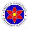
Contrary to popular belief, Haribon Airlines is not an entirely new airline company.
It's actually Philippine Airlines, revamped for a more nationalistic, Asian-inspired, ethnic-Filipino flavor.
This is my conception of a possible new logo for what will become known as (full name) Haribong Maharlika Airlines. (I was too lazy to include the "Maharlika" in the logo name.) Why Maharlika? That was once a proposed new name for the Philippines itself (it's the noble warrior class of the precolonial Philippine kingdoms), and if changing the country's name ever pushes through, "Haribong Maharlika" would be a good concept of a name for the country's flagship airline. Kind of like Garuda Indonesia. And why Haribon? The Haribon, or the Philippine Eagle, is one of the largest birds of prey and it is a truly majestic sight flying in the dwindling Philippine forests. (Besides, I also think it should be on our national coat of arms. I know there's an eagle there, but it looks more like the American bald eagle.)
I designed this proposed logo because personally I felt the existing logo of Philippine Airlines is a little too drab or simple. It's a stylized depiction of the Filipino flag … but then again, so is this new logo. The yellow circle's the sun, the three dots are the three stars, and then of course the red and blue are there. The wings, well, that's the "Haribon" part.
(The red and blue can even serve the dual symbolism of langit at lupa, or heaven and earth - the red being the earth, and the blue the sky. The yellow circle in that case becomes the bridge between the two realms - precisely the job description of an airline.)
I have another alternative version of this logo currently in the works. Coming soon.
Image size
5095x2301px 758.78 KB
Make
EPSON
Model
Perfection 2480/2580
Comments5
Join the community to add your comment. Already a deviant? Log In
I recently discovered this.